Logos and slogans define a university, its students and its direction. In spring 2015, Southeast Missouri State University adopted the sixth logo in the university's history to coincide with the second branding initiative, "Will to Do." As the university transitions its marketing materials to the current brand, forgotten is the history of the previous logos, which began in 1873 when the school was established.
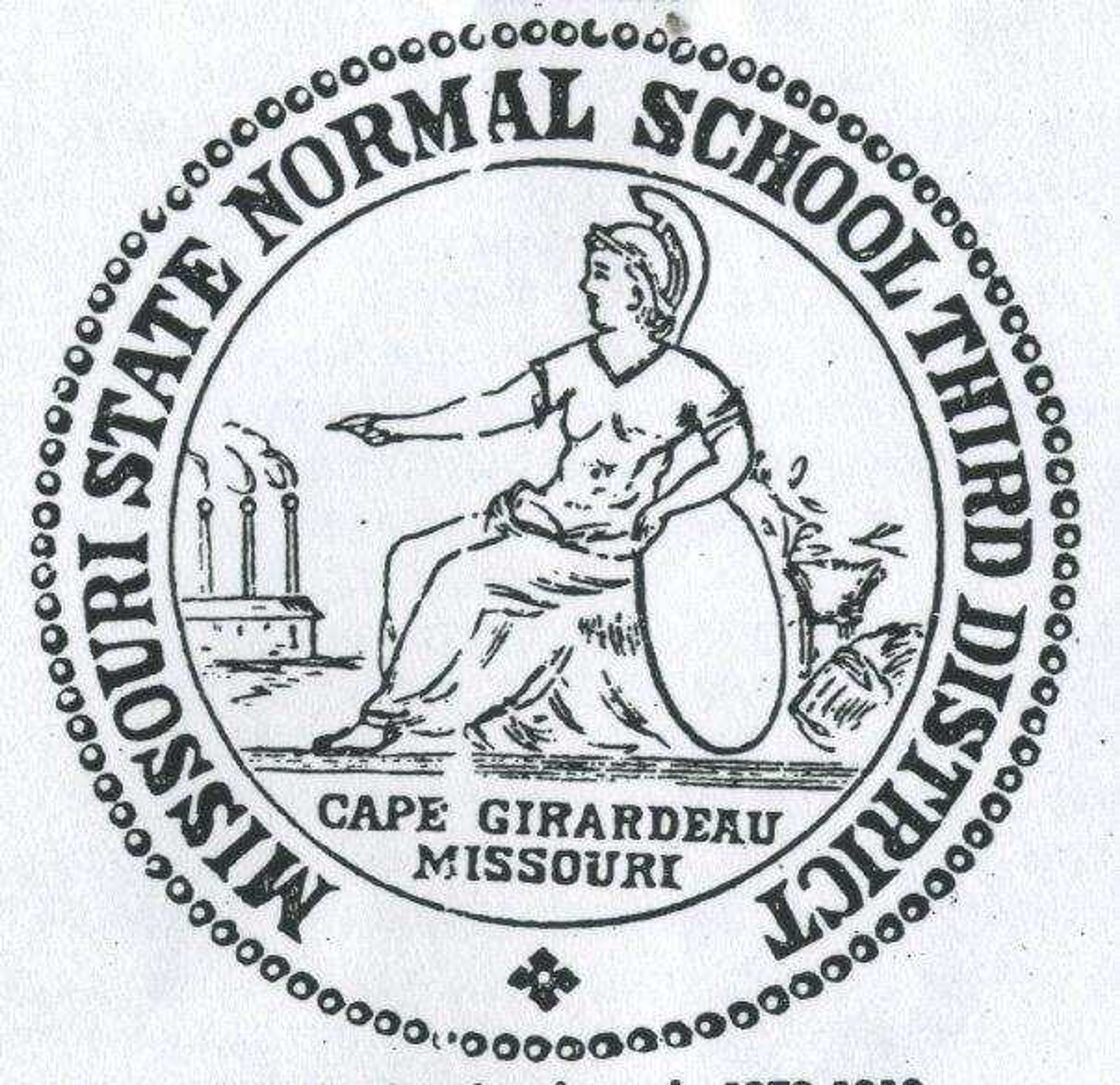
Southeast's presidential seal, adopted in 1972, represents the original seal used by Southeast when it opened as the Southeast Missouri Normal School. The woman pictured is the Roman goddess Ceres, who was worshipped by Romans as the goddess of agriculture and grain.
The smokestacks in the background and the image of Ceres in the first logo were intended to represent business and agriculture, staple economies of the region. When the university became Southeast Missouri Teacher's College in 1918, the seal did not change.
Southeast made the transition from a state college to a state university in 1972 thanks to legislation pushed by college presidents across Missouri, according to Dr. Charles Wiles, who was employed by the university for more than four decades. In the same year, additional changes were made to the current presidential seal, showing Ceres noticeably slimmer in different clothes. The smokestacks (without smoke) and grain were replaced as well in reference to the original seal.
Minor changes were first applied to the logo in 1946, when Southeast officially was recognized as Southeast Missouri State College. The overall image was darkened, with the smokestacks becoming a Roman temple and the border becoming rope. Ceres' posture was straightened as well. According to Wiles, although Southeast had become a state college, many individuals still considered Southeast to be strictly a "teacher's college."
One year later, Wiles, as director of public field services (now considered public relations), was commissioned by former university president Dr. Mark Scully to create a new advertising campaign for Southeast in celebration of its centennial anniversary, including a new position and logo.
Wiles said the campaign was intended to present Southeast as an institution offering more than degrees in education and begin advertising for the first time in St. Louis.
"It was my job to position us differently, so we went into St. Louis with a paid advertising campaign and did what is today elementary," Wiles said. "I added up all of the majors and minors and determined we had over 150 areas of study. We started to hammer away at that fact to change the previous position and say that we were no longer just a teacher's college. We didn't want to diminish the role of education, we wanted to tell people we were more than that. We were very successful at it."
The logo from the campaign, created by former associate professor of art Roy Schoenborn, was the first to incorporate the dome of Academic Hall. One of the most noticeable sights on campus, the dome was intended to represent Southeast traditions. The dome from this logo is currently part of the University Foundation's logo.
In 1988, Southeast hired a consultant to create a different logo, according to Director of Publications Juan Crites. The dome was redesigned to emphasize the architectural elements of the dome, including a shadow on the left side. Unlike the previous logos, the text was placed below the image rather than circling it, emphasizing "Southeast."
Wiles helped craft Southeast's previous slogan, "Experience Southeast Â… Experience Success," adopted in April 2002. He said the slogan was carefully positioned to say the university could provide real-world experience in different areas.
"Every department on campus had some form on experiential learning, making connections to the real world," Wiles said. "You can't promise people that they're going to get a job, but you can say that they will have an experience here."
In regard to athletics, when Southeast adhered to the "Indians" mascot prior to adopting "Redhawks" in January 2005, there wasn't a mascot to represent the Indians. Wiles, who designed Rowdy the Redhawk, said the university had "nothing" in terms of marketing for the Indians mascot.
"There was nothing for kids to take pictures with, nothing to appear on a T-shirt," Wiles said. "Several presidents wouldn't let us use the word 'Indians.' Hundreds of requests came in for Rowdy to appear. We had requests from elementary schools, parades and faculty groups. Rowdy was everywhere. I see him appearing at non-athletic events as well as the athletic ones."